KUIPER Twenty Seventeen is a highly customisable theme for WordPress. It is a child theme of the enormously popular Twenty Seventeen but, unlike the parent, it allows you to extend the page width, customize fonts and colors, and change how the featured image is displayed.
It is the theme in use on this website.
You can download it from GitHub. The parent Twenty Seventeen theme must, of course, be installed first.
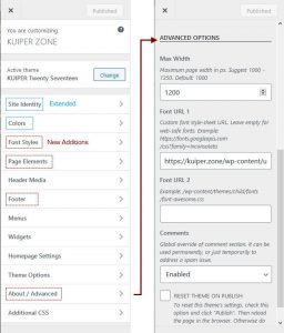
Out of the box, unlike its parent, KUIPER Twenty Seventeen defaults to websafe fonts. You can, however, change this and set custom web-font CSS links from the Customizer (see below right).
The child theme allows you to:
- Extend the maximum page width.
- Fine control of header and footer text using HTML.
- Include Open Graph meta tags in the header.
- Position the logo image in the header.
- Use either the parent featured image style, or a more traditional “standard look”.
- Specify colors for individual elements, such as heading and links.
- Set fonts names and sizes for individual element types.
- Add a configurable “author bio” section on posts.
- Specify web-font URLs from the customizer.
- Option to remove all theme mods.
The screenshot, above, shows the Customizer. Existing parent sections which have been extended with additional options are shown in blue. New sections specific to KUIPER are highlighted in red.
KUIPER Twenty Seventeen is licensed under GPL, so you are free to use and modify.
Background Trivia
Generally, I find WordPress themes not to be particularly customizable. I can certainly see the sense in this, as lots of configuration can lead to design and maintenance complexity. Nevertheless, as I have several websites, each with a particular focus and style, I wanted a single theme which I could tweak to my own requirements from the Customizer.
I began working on a child theme of Twenty Sixteen a few years back to do just this. However, I found it difficult to override the page width of this theme safely as its layout is complex. In the end, I got side-lined with other projects and never fully completed it.
More recently, I tried again with Twenty Seventeen and found it much easier to extend. I made a few changes regarding content width as I cannot comprehend why, when modern monitors have widths in excess of 1920px, it imposes an effective upper limit on content of 740px. (In its default two column mode, the maximum parent width for pages is a mere 525px!)
Hint. To extend the page width of KUIPER Twenty Seventeen, set “one column” pages from “Theme Options” and then, from the “Advanced” section, increase the “Page Width”.
A notable feature of Twenty Seventeen is its use of large header and post images. I think this produces a great look. However, for websites where the focus is one of textual content, ginormous banners can be a little distracting. For this reason, I added an option to override the parent featured image layout to display a more traditional smaller alternative (this is optional).
Otherwise, while there are a plethora of options in KUIPER Twenty Seventeen, especially with regard to fonts and text, I generally took the approach of leaving the underlying mechanics of the parent theme unchanged as far as I could.
Note. In Twenty Seventeen, the sidebar is shown only on posts (not pages). This is not something I’ve changed in the child theme.
If you find KUIPER Twenty Seventeen useful or have a suggestion, feel free to drop a comment below.


